

LOUVRE REDESIGN
CONTRIBUTIONS: BRANDING | VISUAL DESIGN | UX DESIGN | INTERACTION DESIGN
PLATFORM: DESKTOP
TIMELINE: 1 WEEK
*This is a conceptual redesign.
THE PROBLEM
The Louvre is one of the most visited art museums in the world because it holds famous works like The Mona Lisa or Venus de Milo. The website is however, difficult to navigate to find prominent works of art.

The current Collection page for the Louvre
As I went through the design process, I decided to focus my efforts on:
How might I make it easier for users to find prominent art pieces on the Louvre website?

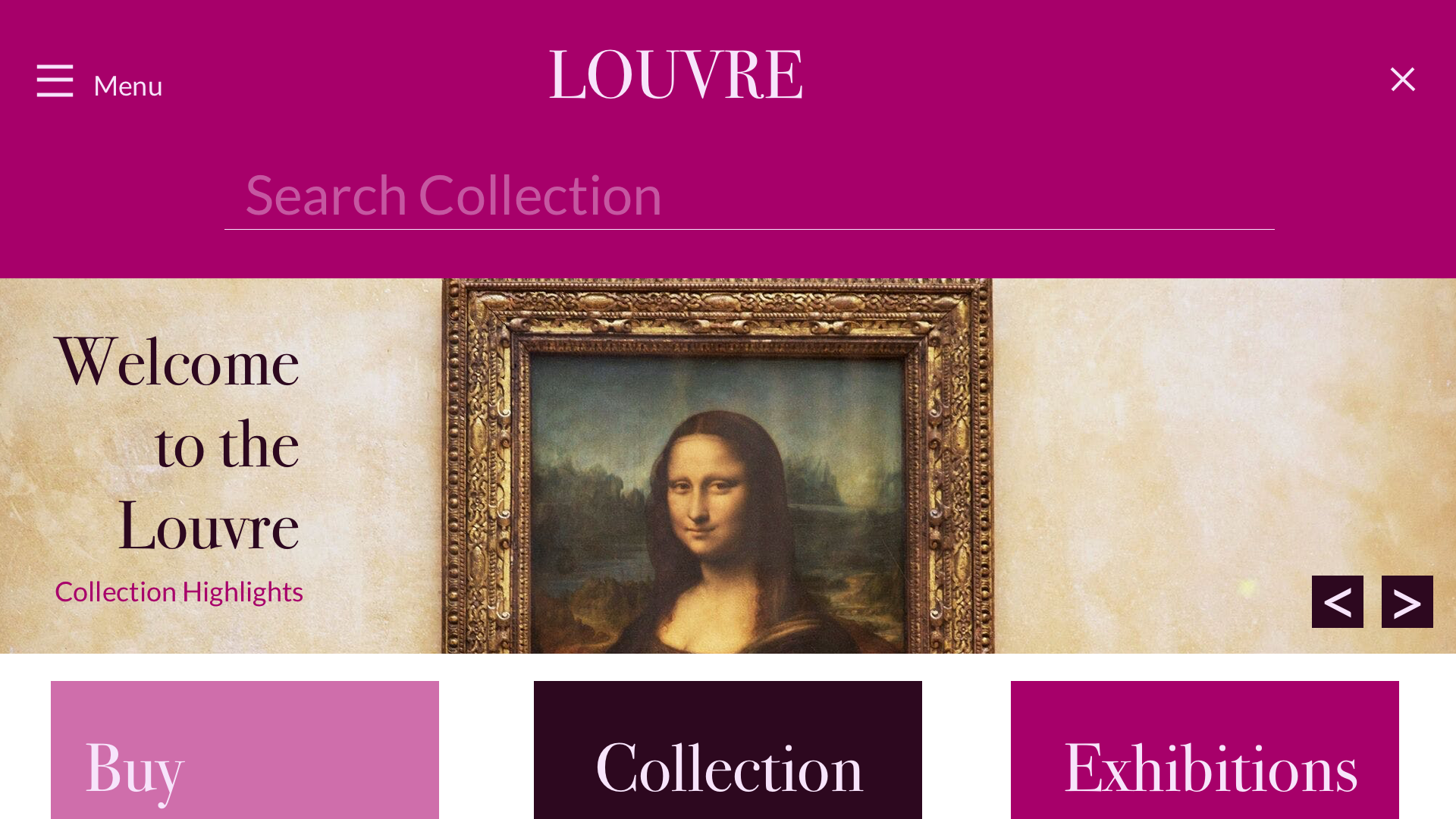
The original website homepage

Redesigned homepage
DISCOVERY: WHY REDESIGN THE LOUVRE WEBSITE?
Testing Assumptions and Defining Goals
I broke down what users’ goals and pain points were based on interviews with avid museum goers as I began my journey to redesign the site.
Users’ Goals:
(Question posed to users: why do you want to see prominent art pieces?)
Gain knowledge about the work
See what is on display at the Louvre
See the value of the Louvre as an art institution
Wow peers with knowledge of the works
Pain Points
(Question posed to users: after using the website, what was the hardest part of the experience?)
Users want to get information about prominent art pieces but they have trouble getting to their end destination
The current experience is difficult to follow with many intermediary steps to get to prominent pieces of art
RESEARCH: FLOWS AND COMPARITIVE AUDIT
What is the Current User Journey?
I decided to map out the flow to see the full user journey of navigating the website when it came to looking for prominent art pieces. Let’s say I decide I want to look for…
CARAVAGGIO’S DEATH OF THE VIRGIN (1604-06)
It’s a famous work but not as much of a flagship work as the Mona Lisa (which one can navigate to from the home page carousel).
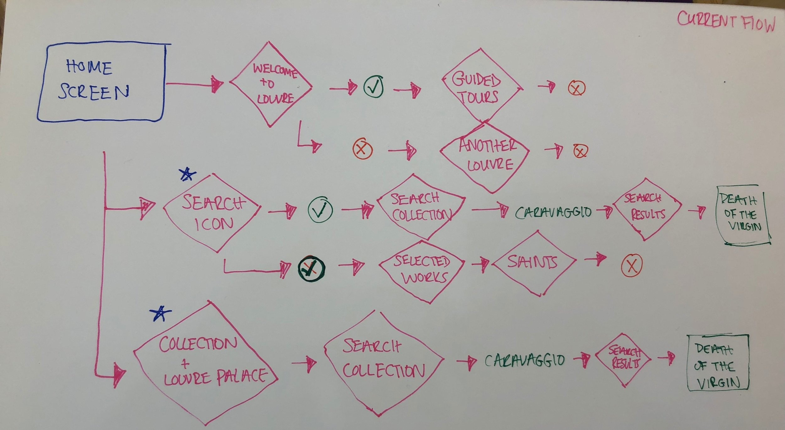
Why is this a problem?
Even with multiple access points to the painting, three of the flows wouldn’t even get the user to the correct work.
What are other art museums doing?
Once I saw what the Louvre was doing, I wondered if other art museums had a better solution or even ran into similar problems when organizing their content for prominent art pieces. I decided to look at..
National Portrait Gallery
Let’s say I want to see information about the famous Obama portrait. You would think I could just click on the homepage right?

Unfortunately no! Clicking on the painting does not take me there, it takes me to a media article about the unveiling of the painting. Here’s what I have to do to get to the painting.
How about trying to click on Presidential Portraits at the bottom of the homepage and then go through each president?
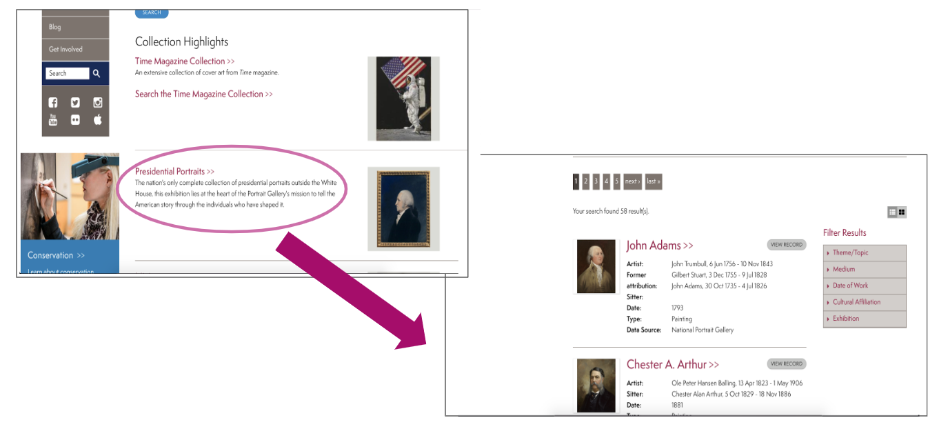
Nope! The Presidential Portrait exhibit is strangely organized (neither by chronological nor alphabetical order) and Obama’s portrait is not found at all within this section.
To actually get to the Obama portrait you have to go to current exhibitions on the side navigation then scroll down to the Obama portrait exhibit.

NATIONAL PORTRAIT TAKEAWAYS - WHY DOESN’T THIS FLOW WORK?:
The National Portrait Gallery, although clean in visual design, does not have the easiest navigation for prominent art pieces
The user likely has to know what exhibitions are in rotation to find the right information
2. SFMOMA
The SFMOMA is known prominently as a modern art museum and the visual design is reflective of this.
Let’s say I want to see Louis Bourgeois’s “The Nest.” Immediately, you can see the search bar. The menu, although vast, is a burger menu so the user can choose whether or not to display it. I can see “The Nest” right away after a quick search.

But let’s look at another flow

Let’s say I use the navigation bar and go to “Artists + Artworks” and then to “Painting + Sculpture” (because “The Nest” is a sculpture)
If I scroll down, I immediately see her work!
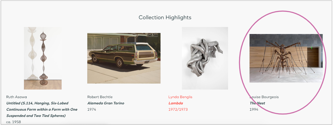
SFMOMA TAKEAWAYS - WHY DOES THIS FLOW WORK?:
The SFMOMA is easy to navigate even if the user does not know exactly what they are looking for
IDEATION: WHAT IDEAS COULD I TRY?
Sketching Ideas for Improvement
I began listing out changes to the website I gathered from user interviews and my comparative museum audit then drawing them into sketches.
Some of my ideas included:
Put search bar at the top, rather than on the side
Have similar works appear when a user searches for an artwork
Replace numbers in carousel with arrows
Tag system to filter through prominent collection pieces


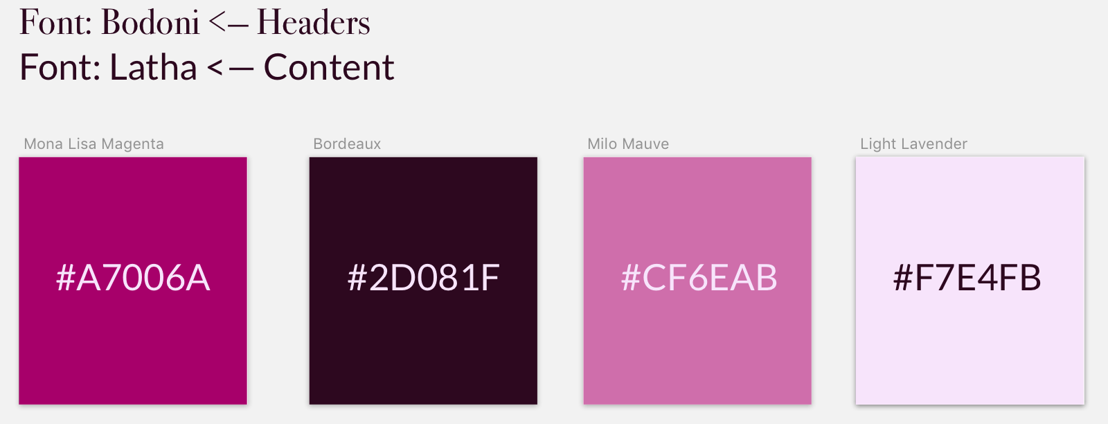
Visual Identity
The current site actually has some really great colors! I decided to capture and rebrand them with my own names.
Colors
Mona Lisa Magenta - the main background color used in the navigation bar
Bordeaux - a dark wine color used for content
Light Lavender - light color used for navigation
Milo Mauve - medium color used for buttons and thumbnails
Why do these colors work?
All of the colors were already used by the current website. They are rich tones that represent the identity of the Louvre as a premiere art institution. I simply repurposed them to fit the redesign in a more purposeful way by giving the colors hierarchy.
For fonts, I spent time looking for fonts that I felt would best represent the identity of the Louvre as being classic and elegant. I also focused on choosing fonts that were similar to the current fonts in use: Georgia for headers and Arial for content.
Fonts
Headers: Bodoni - Bodoni was originally used to in Italian book making in the 1900s and is the font for fashion brands like Armani Exchange and Calvin Klein. It has elegant thin serifs that I felt was a modern update to the Louvre’s current use of Georgia.
Content: Latha - Latha is a modern san serif typeface. The Louvre website currently uses Arial for I thought this was a step up for its slightly curved letters that are reminiscent of French vineyards.
**FUN FACT: Bodoni is also the typeface Nirvana used for their logo!
Why these Fonts (as opposed to what is currently on the site)?
Bodoni replaces Georgia as the logotype and primary typeface. Georgia is a serif font that evokes some elegance but is not visually strong enough to be a primary typeface.
Latha replaces Arial as the content and data typeface. Arial works well as a content typeface but I felt that Latha’s stronger curves within the lettering evoked more prestige that would likely be associated with a premiere institution like the Louvre.
PROTOTYPING: THE REDESIGN AND PROTOTYPE
The Homepage
The new homepage immediately points the user to the Collection Highlights page in the carousel as well as through a thumbnail further down. Other thumbnails include the option to buy tickets and see what special exhibitions or events are on display.
Navigation Bar and Menu
There is also a navigation bar at the top that is similar to the SFMOMA’s with a burger menu and an option to search through the collection. The new menu has the same content as the current website menu but with bigger type, using the new color palette and fonts, and a bigger button to buy tickets.


Search Bar
The search bar borrows from the style of the SFMOMA and appears when the user clicks the search icon. When they type in their desired collection piece, the result narrows down to the thumbnail. In addition, users get recommendations for similar works to their search result for easy access to other art.


The interactive flow for search can be seen in the video below.
Tagging Prominent Art Pieces
A new feature I focused on was making it as easy as possible for a user to find prominent art pieces. I created a tag system for prominent art pieces with typical focus points for art such as:
Movements i.e. Romanticism, High Renaissance, Baroque, Rococo
Dates i.e. 16th century, 1555, circa 1402-1405
Artist i.e. Caravaggio, Leonardo Da Vinci, Antonio Canova
Medium i.e. Oil on Canvas, Sculpture, Acrylic on Canvas

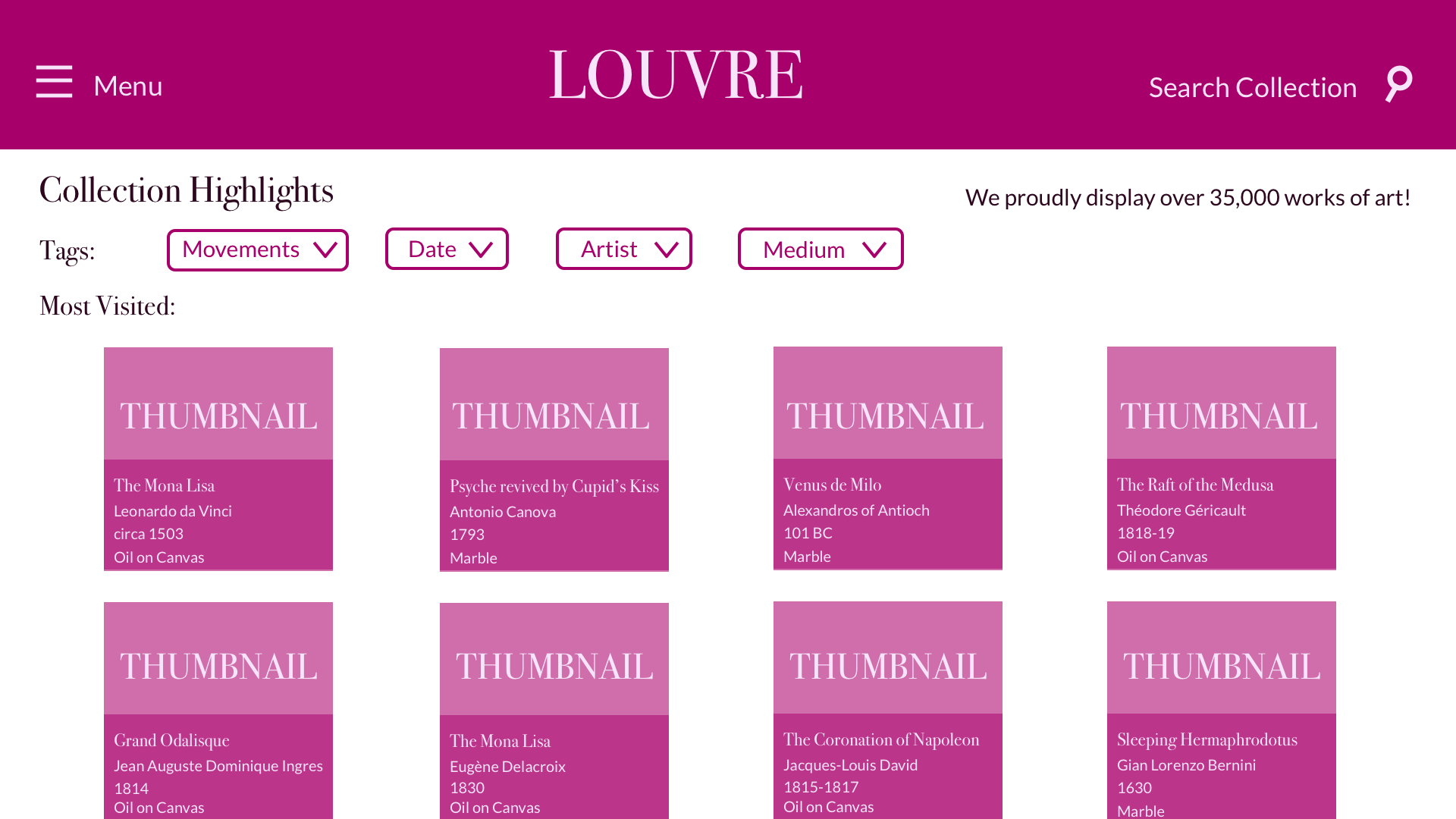


The interactive flow for the tagging system can be seen in the video below.
The full interactive prototype is also available on InVision below.
INVISION PROTOTYPE
EVALUATION: REFLECTION, FEEDBACK, AND FUTURE ITERATIONS
So what did I learn?
Art museum websites are dense - there is so much content from artists to pieces to movements.
Organizing information is complex - I only tackled a few parts of the website and a lot of considerations had to be made. The full website architecture would certainly be a larger task.
What improvements can still be made?
Add movements within thumbnails so tagging categorization is in line with thumbnails
Have a “show more results” button as user scrolls down
Use site analytics to improve other experiences like buying tickets or events
BONUS*
I presented this redesign to a potential client show my design process. Check it out below!