
PRODUCT PERFORMANCE DASHBOARD
OVERVIEW
Through an internal startup for federal services within Deloitte, we created a dashboard to show developer performance metrics across projects/portfolios. We were able to create a scalable architecture that was later iterated on with product manager performance, modeling complex BPMN flows, and internal messaging/notifications. We also had wider adoption from other federal agencies with the initial product being valued at $2 million and increased interest in design services for our design practice at Deloitte by 25%. (B2B, SaaS)
ROLE
User Experience Designer, Deloitte
MEDIUM
Desktop
TIMELINE
Sept-Oct 2021 (6 weeks)
THE TEAM
2 UX Designers, 1 Design Manager, 1 Project Manager, 2 Developers, 1 Requirements Analyst, 1 Managing Director
Live site not available as this is an internal B2B SaaS enterprise tool.
THE PROBLEM
Our client wanted to develop a dashboard for developers to measure their performance across different projects and portfolios to monitor their work and progress.
USER RESEARCH: MEASURING SUCCESS
In order to begin creating our dashboard we first needed to have a thorough understanding of DevOps. We began our user interviews with these broad questions:
What makes software delivery elite?
What data makes up metrics of success?
What are the roles in software delivery and what matters to them?
How can a portfolio manager navigate between metrics of success across a product portfolio?
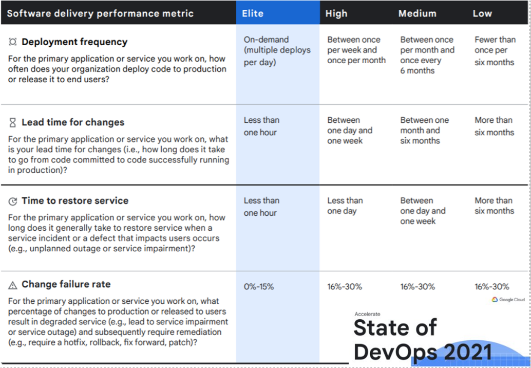
State of DevOps 2021 graphic
DEVELOPING PERSONAS
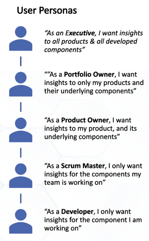
Brief description of developer user personas based on role level.
We developed 5 personas for varying developer roles after several rounds of interviews from the developer to executive level to showcase how their requirements might change based on their role.
Ex. Portfolio Manager whose concerns include:
See dashboard & a few metrics
User adoption
Something complex and component driven
Being able to go to an organization manager in the dashboard
Change component to product assignments
Go back to dashboard
See updated metrics
METRICS ORGANIZATION
VISUAL CARD SORTING
We worked with users and stakeholders to organize metrics across four categories: delivery quality, delivery performance, Usage, and User Experience.
CATEGORIZING METRICS ACROSS ROLES
With metrics categorized we built a diagram to visualize which metrics were of importance to a given persona.
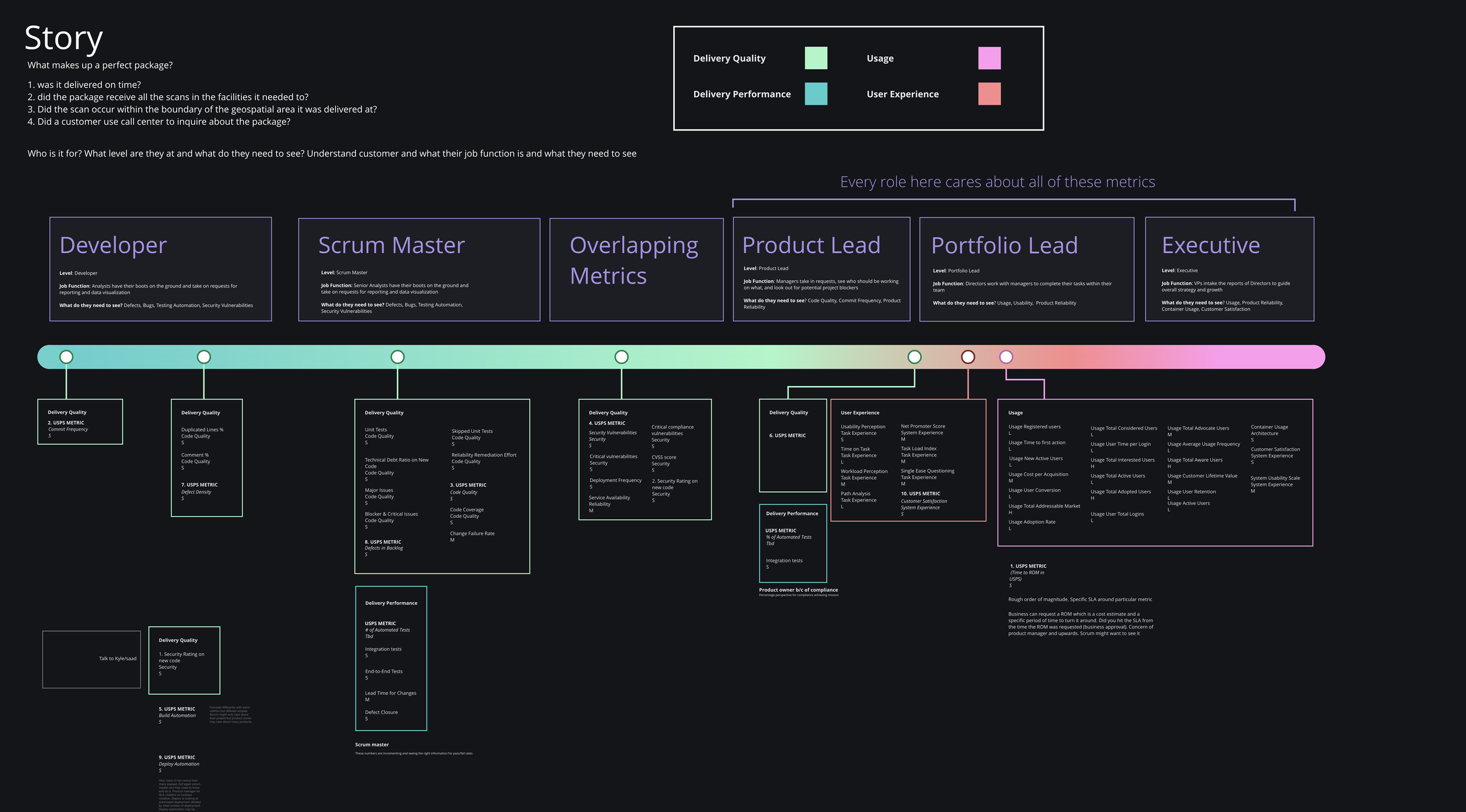
Metrics organization diagram
DASHBOARD USER EXPERIENCE
Hi Fi Wireframes
With our insights from user interviews and metric organization diagram we were able to take a first pass at building a high fidelity dashboard UX with the branding and color scheme
Through user feedback we found that our version of the dashboard does not reflect the different stages of the development process such as planning, testing, releasing, or deploying.
MODIFYING THE DASHBOARD BASED ON FEEDBACK
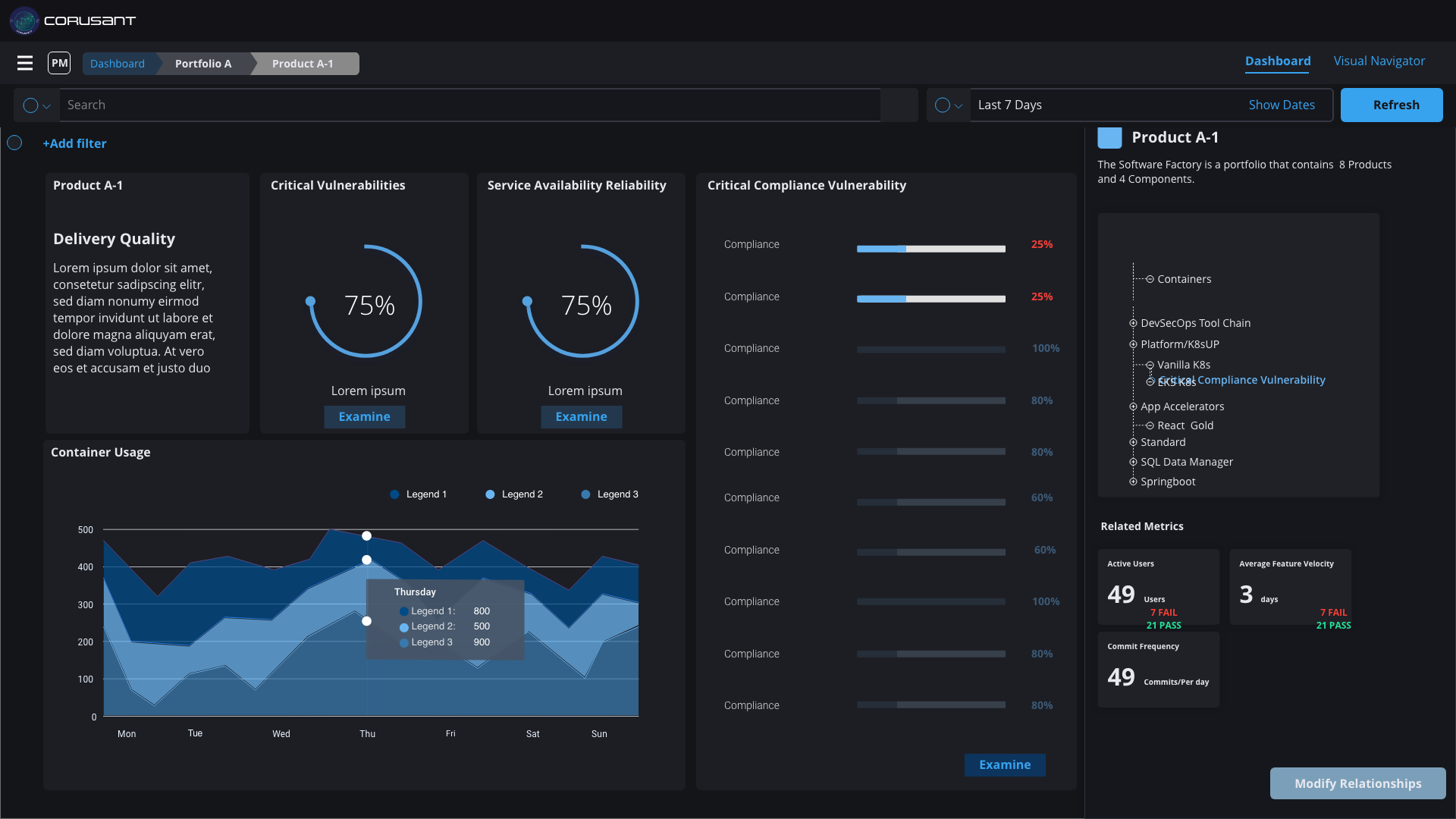
In our revised dashboard portfolio dashboard view we:
Designed the experience to allow for the view of metrics within a portfolio of projects to address delivery challenges
We also added a spider graph to showcase the overall health of the product in different DevOps phases
Added the DevOps phases at the bottom and included the sources of data that each phase was pulling from
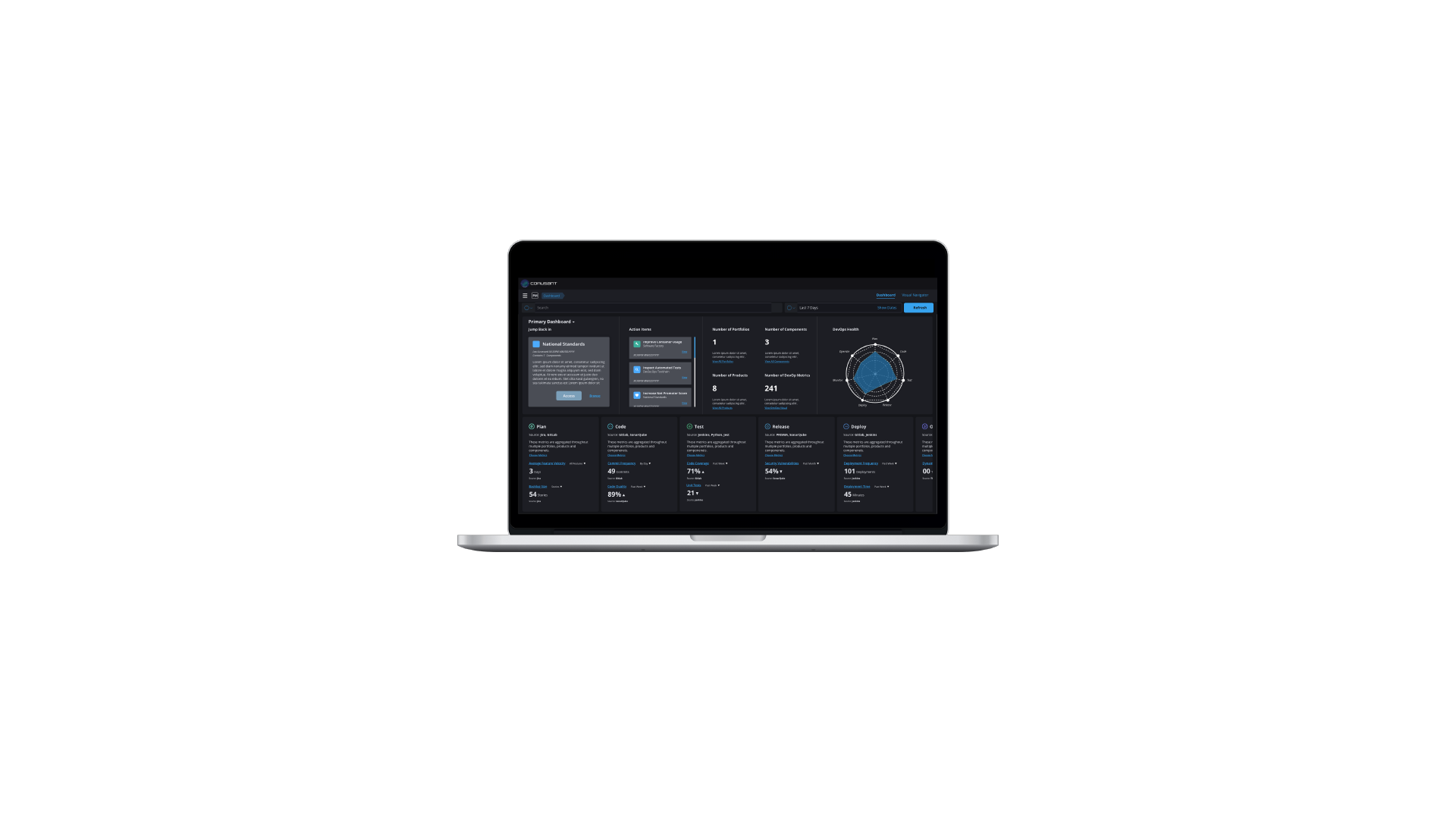
High fidelity wireframe of portfolio dashboard view
ADDING A VISUAL NAVIGATOR
This feature allows the user to navigate between different projects within a portfolio and assign "nodes" such as products, app accelerators, or components.
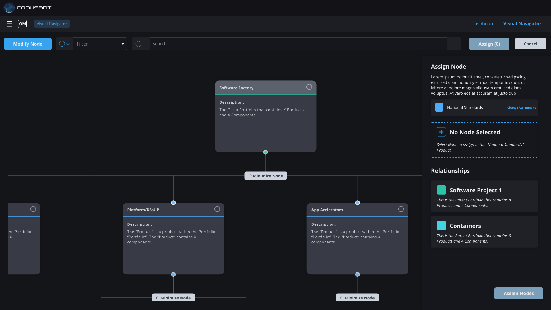
High fidelity wireframe of dashboard visual navigator
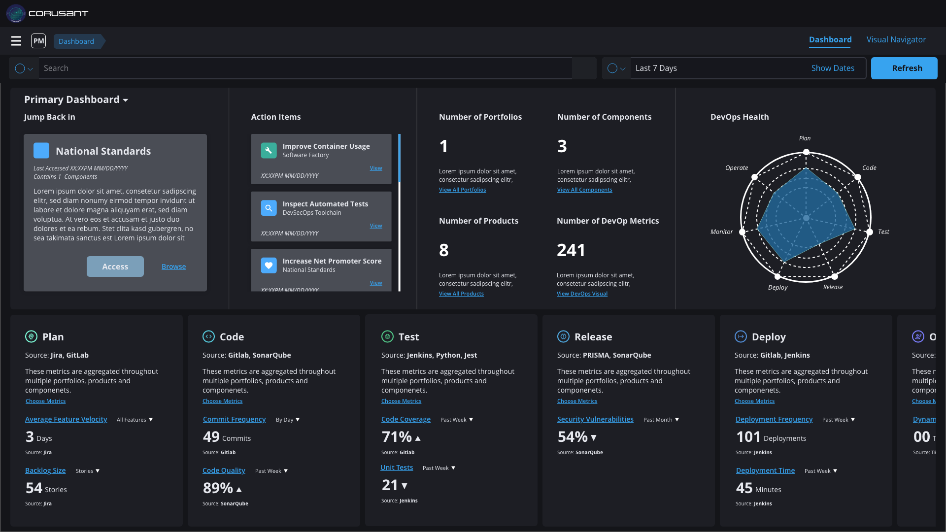
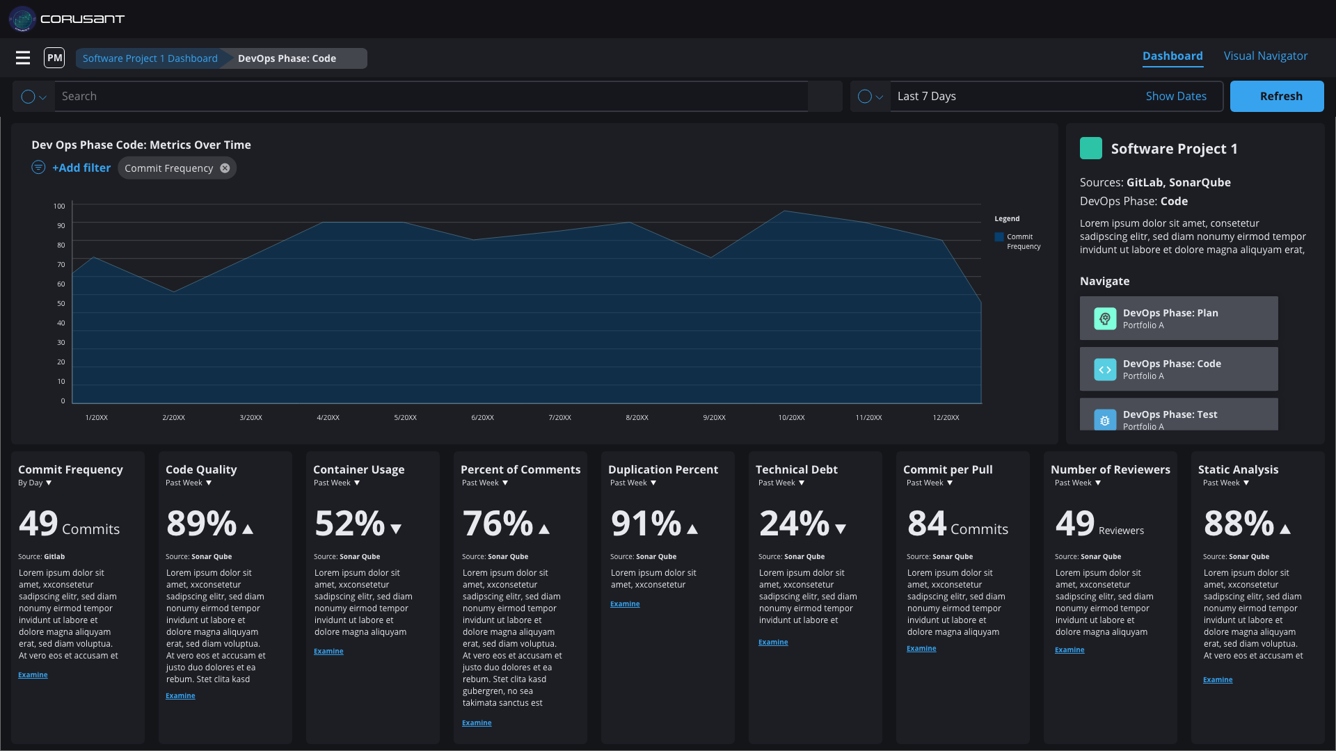
PROJECT DASHBOARD VIEW
Now that we had created a portfolio view and a visual navigator, we could focus on the individual project view. This view experience allows for the view of metrics within a specific project to address delivery challenges.
High fidelity wireframe of project dashboard view
The project view made it easier for developers and managers to see on a granular level what their impact is within a particular phase of a project.
PRODUCT BRANDING: LOGO
In addition to designing the UX of this product, I was also able to exercise my branding muscles and design the logo of the dashboard. I also got to name the product after a Star Wars reference (Corusant without the extra C to avoid licensing issues). The name was intentional too: Coruscant is a planet made up of a giant city and our product was a container for a portfolio of product dashboards within a single product. Below were the initial passes I made regarding the logo.
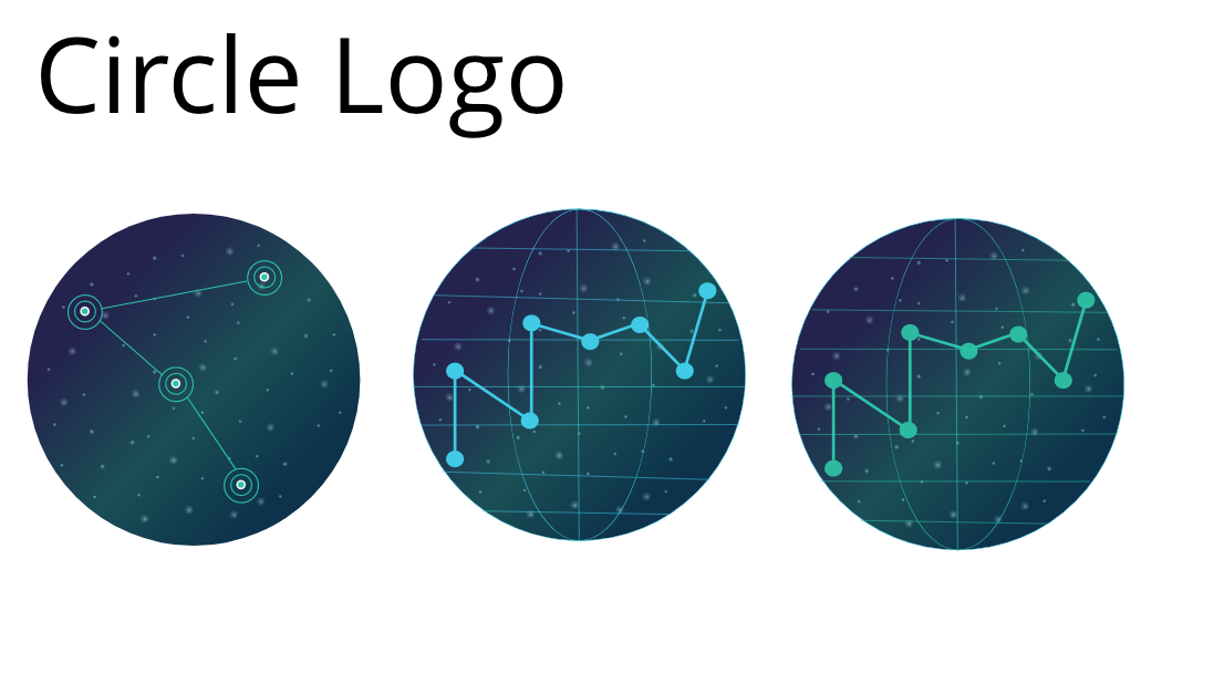
Circle logo options with resembling a planet
I liked the planet looking circle logo but felt it would not stand out against our dark background. I then decided to try for a badge style logo since our client was a federal one and badges were a common branding motif across federal agencies
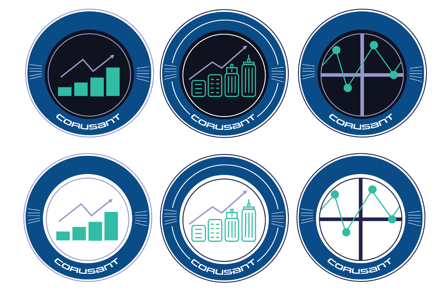
Badge logo options
The problem with these badges were they didn’t really stand out. I then decided to combine the badge idea with the initial circle logo and came up with these three final options.
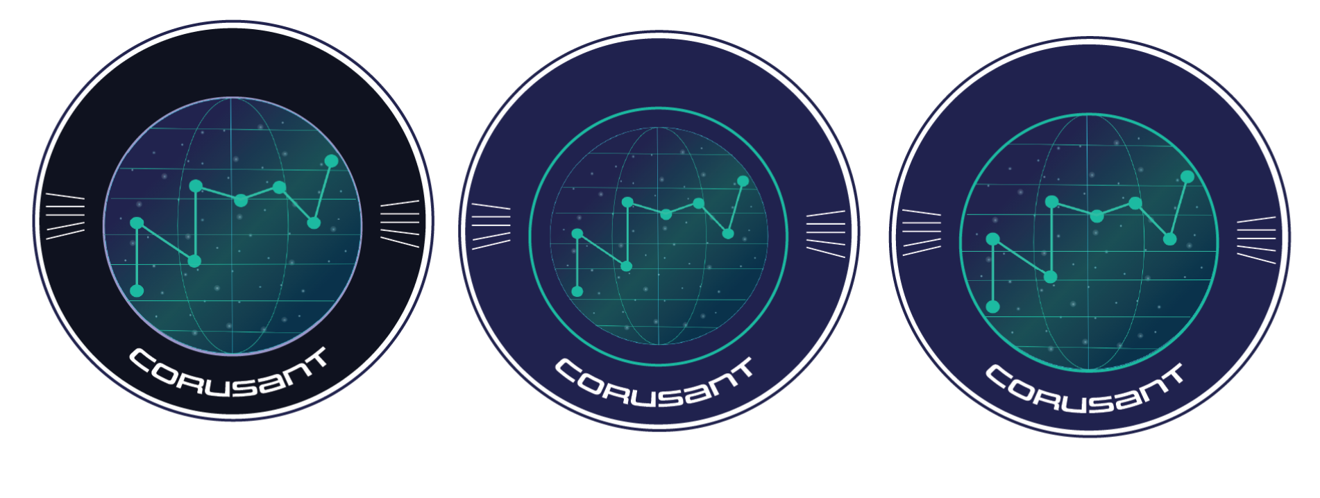
Circle planet logo options
The badges on the planet padded it against the dark UI and made the light teal stand out. When I brought all 12 options in front of our team their favorite ended up being the plane with the purple badge.
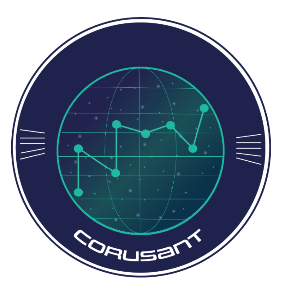
Final logo design
The logo is prominently featured on the login page of the dashboard.
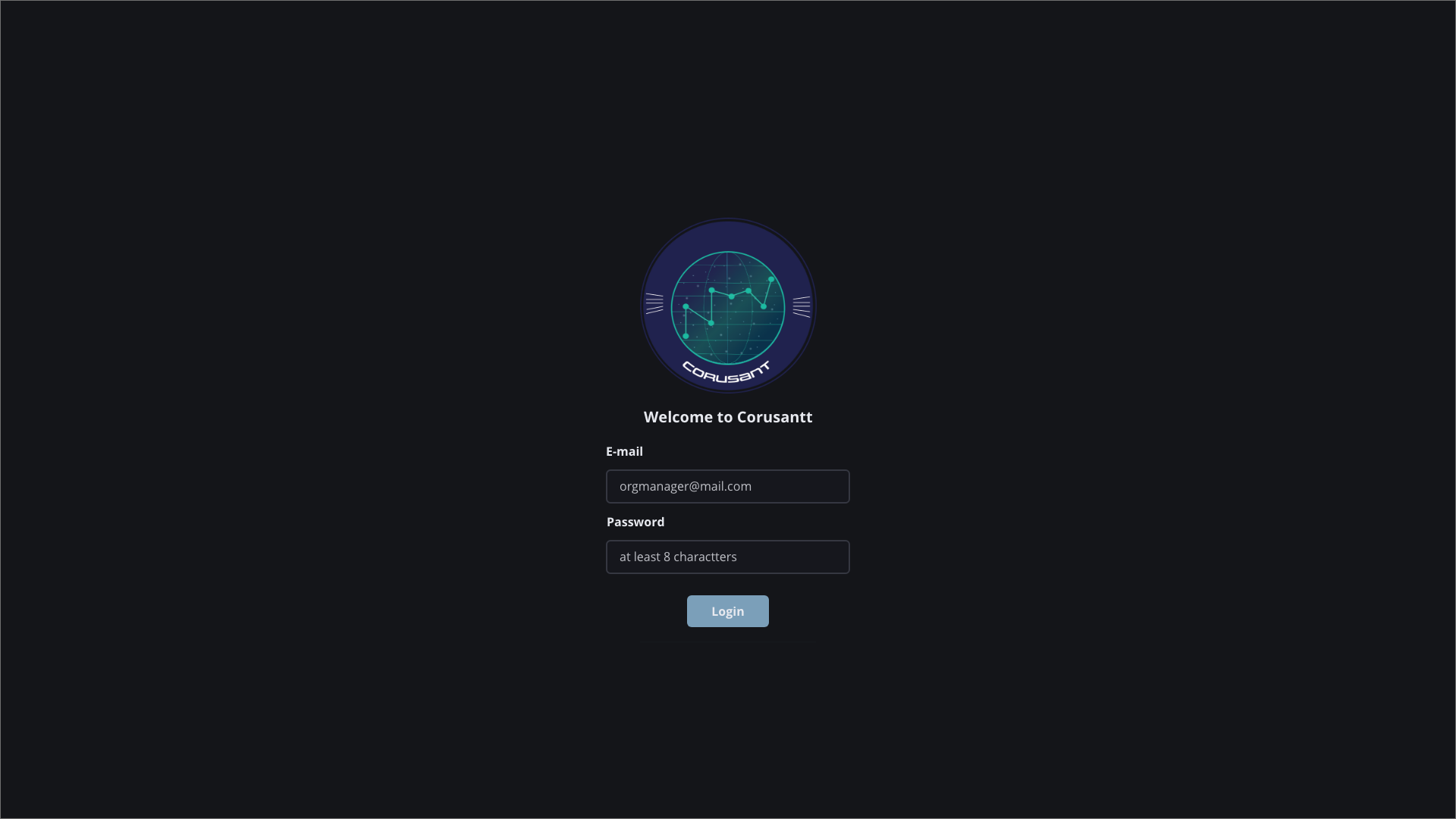
Login page
PRODUCT BRANDING: COLORS
The colors we chose were light cooler tones that worked well against our dark background. One developer we talked to mentioned that bright white screens were straining for the eyes.
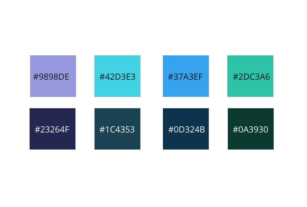
Corusant color swatches with hex values
PRODUCT BRANDING: TYPOGRAPHY
For typography we went with a display font called Uniwars and for content we went with Open Sans. Both went with our Star Wars and space motif but still felt readable.
Uniwars display font
REFLECTION + TAKEAWAYS
Less time can mean more intentionality. The start and execution of this product took about 6 weeks. This did not give us a lot of time and meant our initial user interviews and our feedback sessions had to be intentional.
Playfulness can be a great solution. Corusant’s overall aesthetic came from a playful place and contributed to a lot of positive feedback on our end from our users for the product both looking and feeling good.
THE IMPACT
Mass Scalability Potential. This product became a solution that our firm wanted to use not just for a particular federal client but across our offering portfolio to sell to other potential clients. The product’s architecture had mass scalability potential and could be molded for many roles across different businesses.
Selling Design. I have featured this product in multiple internal decks focused on selling what design can do within our firm. The response has been a lot of excitement around what we as designers can do for clients.