
AMERICAN REVOLUTION HUB
OVERVIEW
We created a hub tied to the Ken Burns film to connect educators to resources, share events, and enable newsletter signup. We navigated CMS constraints, a quick turnaround, and managing stakeholder relationships including the film producers. We were able to implement AI through a copywriting plugin that saved us 12 weeks of time and received high praise from the stakeholders, establishing trust. (B2C, Web App)
ROLE
Senior Interactive Designer, PBS LearningMedia, PBS
MEDIUM
Desktop | Tablet | Mobile (Figma, Pen/Paper, AI)
TIMELINE
May 2025-Sept 2025
THE TEAM
1 Sr. Interactive Designer, 1 UX Director, 1 Product Manager, 1 Sr. Director of Product, 1 Marketing Director, 3 Content Managers, 1 Developer
LIVE SITE
https://www.pbslearningmedia.org/pbsteach250/
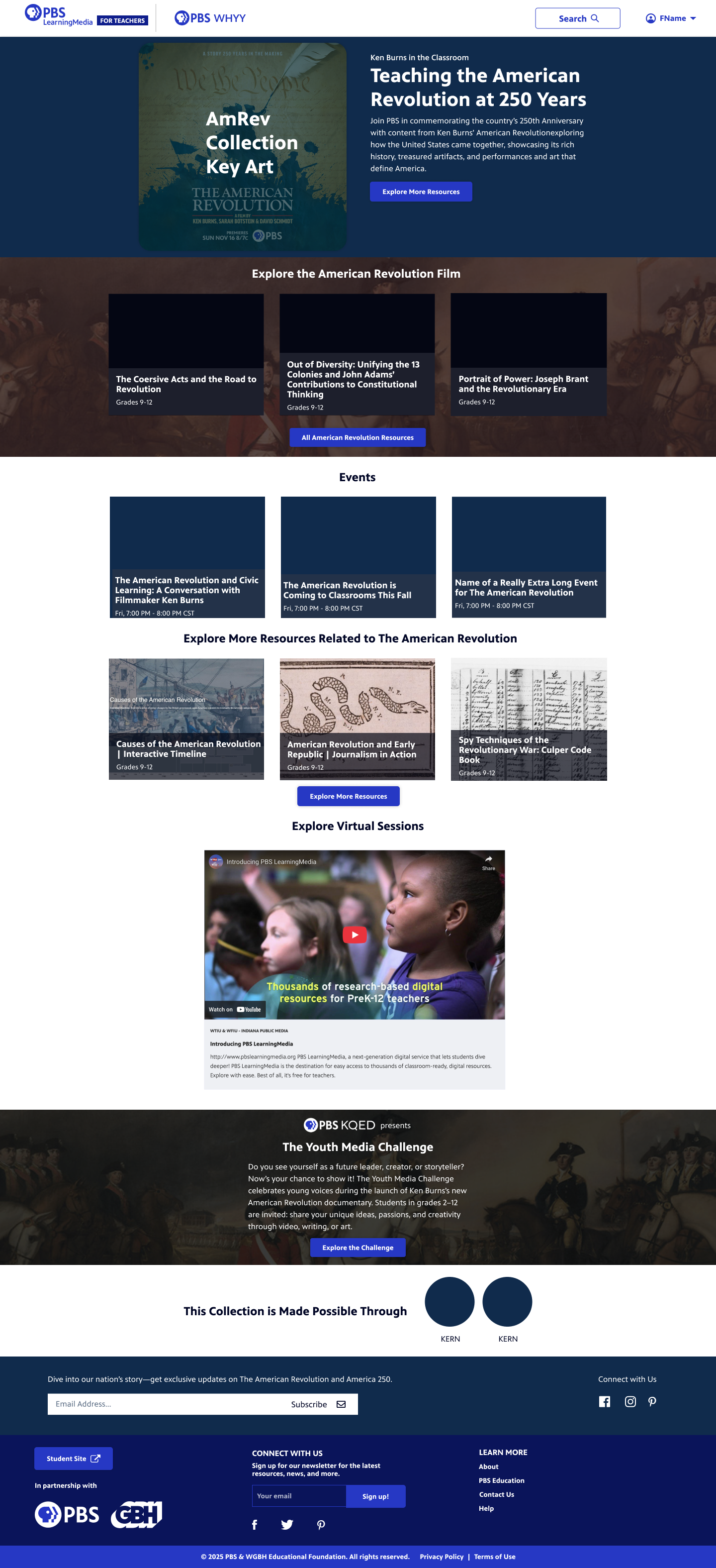
THE PROBLEM
On November 16th, Ken Burns will be releasing a new documentary centering around The American Revolution in celebration of America’s semiquincentennial (250 years). In addition to a show page on PBS.org and a site for the film, we needed to create a hub page on PBS LearningMedia for educators to teach the American Revolution in the context of the film. We wanted the hub to visually feel similar to other promotional sites while also still feeling like part of the PBS LearningMedia brand.
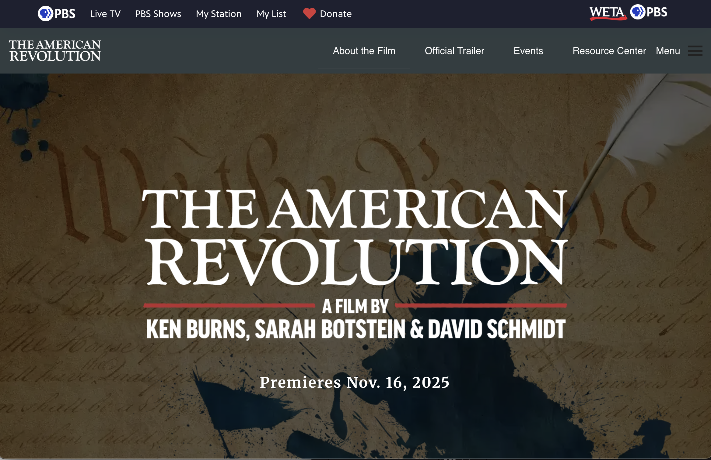
Ken Burns American Revolution Site
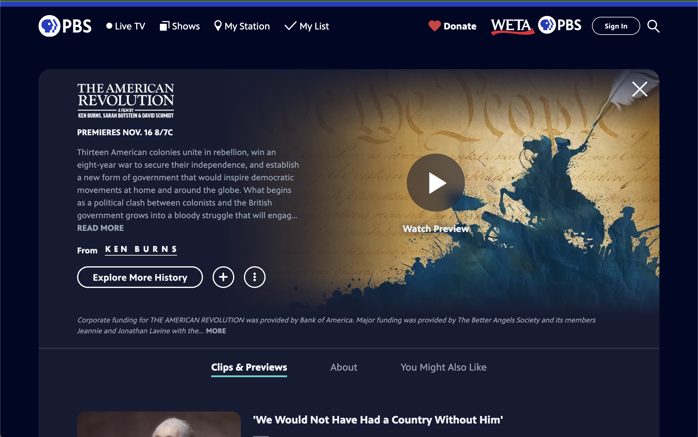
PBS Show Page for The American Revolution
What We Know About Our Users
We know educators value special content around recognizable PBS brands such as Ken Burns, NOVA, and PBS KIDS. This page would align with those expectations.
Working with Constraints
This hub site was going to be built in an internal CMS that has a lot of technical constraints with one developer being assigned for CSS. In order to reduce wasted effort, I spent time talking with our developer around our constraints as well as another Sr. Designer who was familiar working within the CMS to see what we would and wouldn’t be able to build. We also got a wishlist from the marketing team of what they hoped to include on the page.
For context, these were some of the initial asks:
Resource section of Ken Burns related content
General American Revolution content from PBS LearningMedia
Email sign up
Partner section to highlight the filmmakers
An event module
An area to link to KQED’s (PBS Station) Youth Media Challenge
An area to link to the PBS LearningMedia Teacher’s Lounge blog
COMPETITIVE SCAN
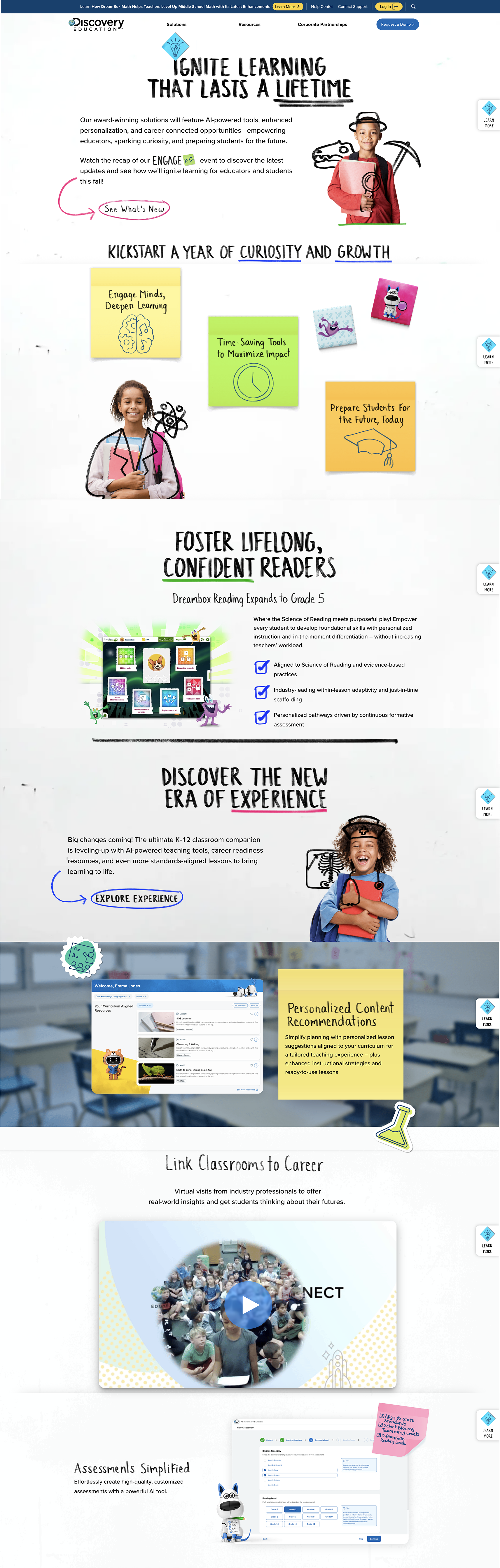
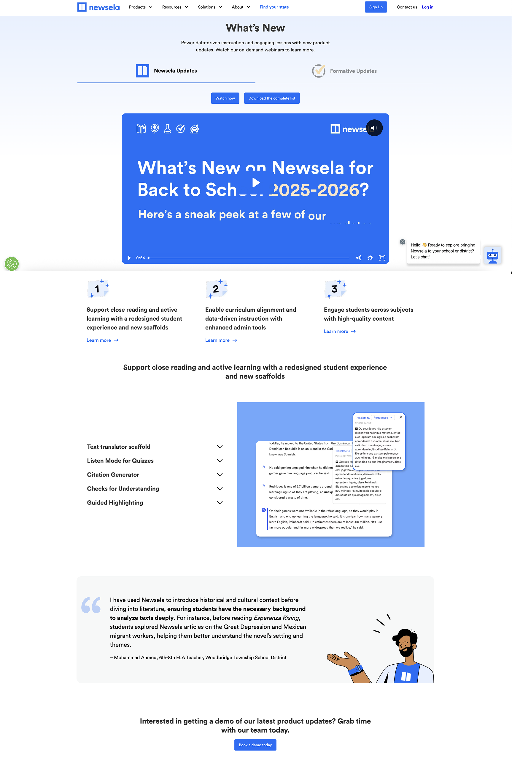
We started with a competitive scan of similar educational platforms (such as Discovery Ed and Newsela) as well as special PBS events page to align with conventions within our industry.
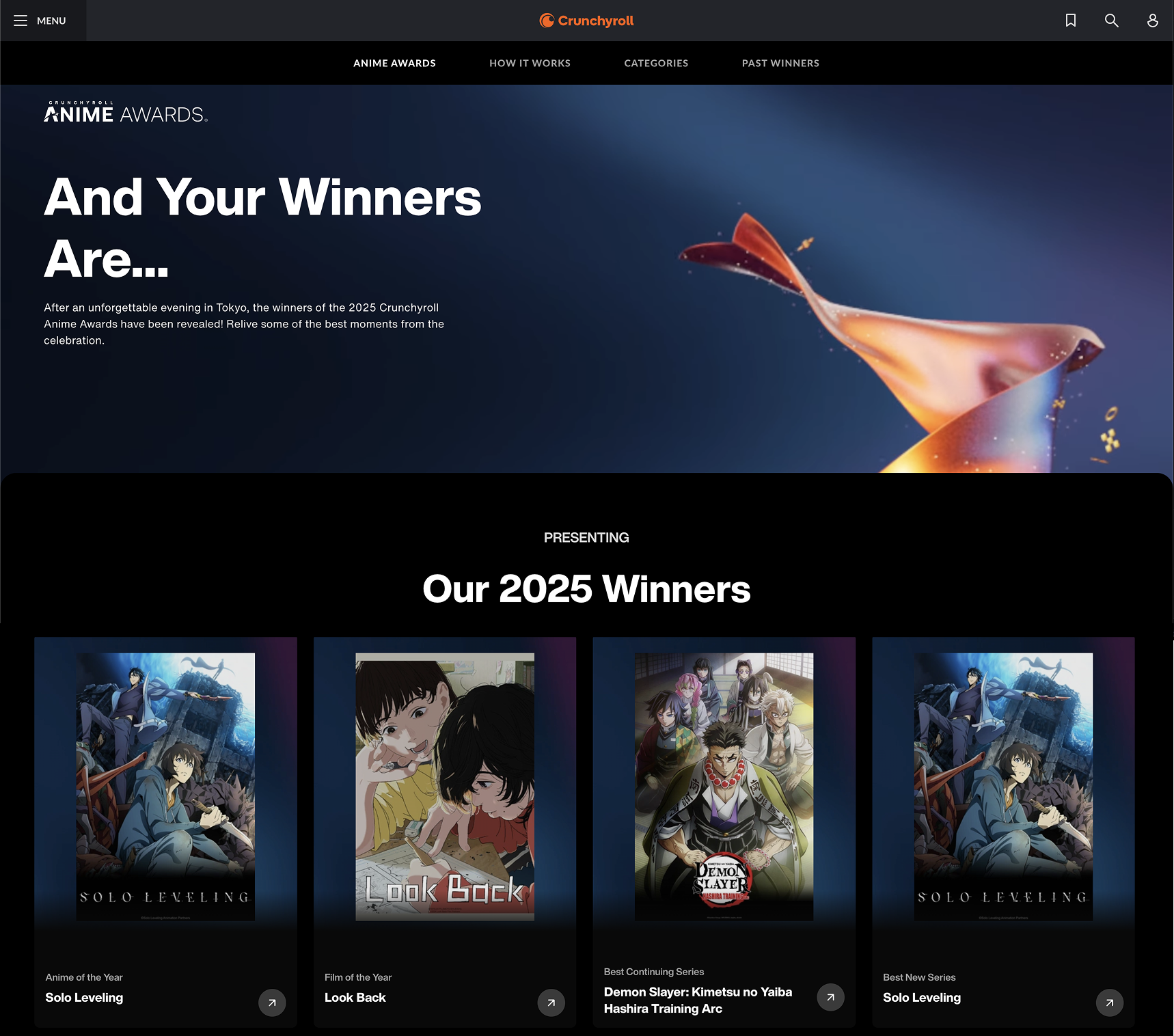
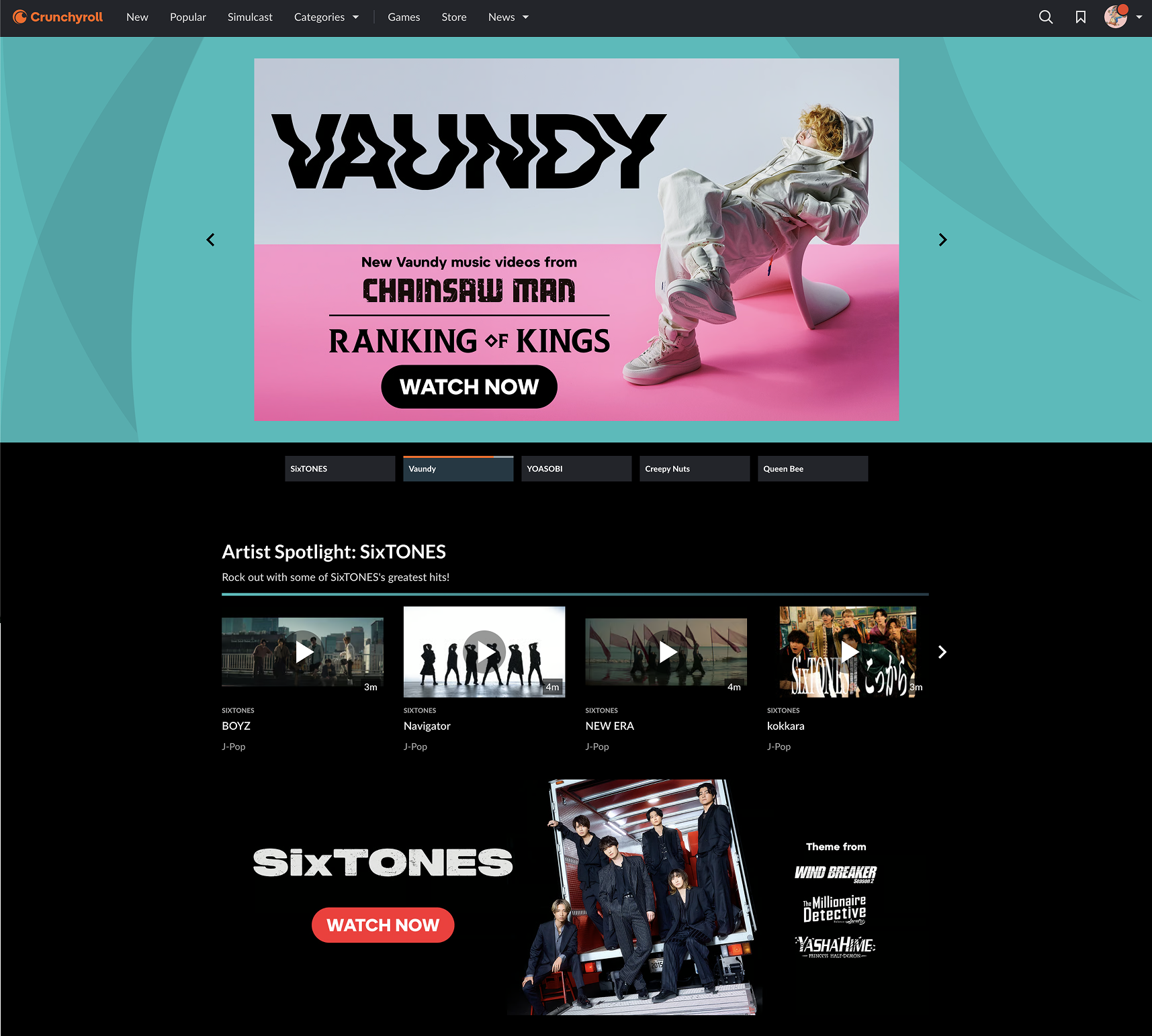
TAKING INSPIRATION FROM UNCONVENTIONAL SOURCES
We also looked at sites that weren’t necessarily related to Education but had big splashy event pages with lots of visual elements such as the Crunchyroll Anime Awards page.
INITIAL CONCEPTS
Initial Sketches
With our insights from the competitive scan, initial wishlist, and conversations with developers and a SME for our CMS, I began sketching ideas for how the page would be laid out.
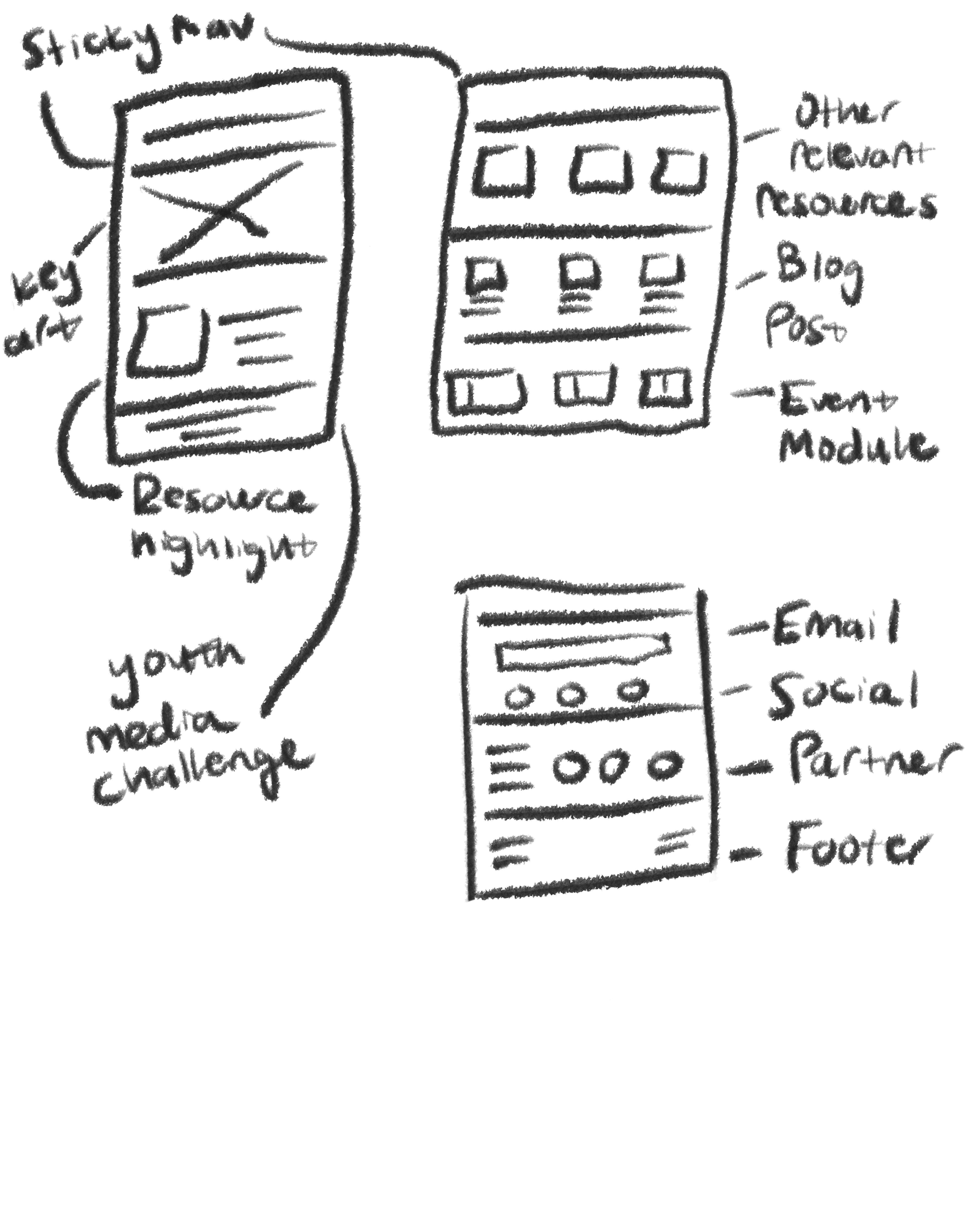
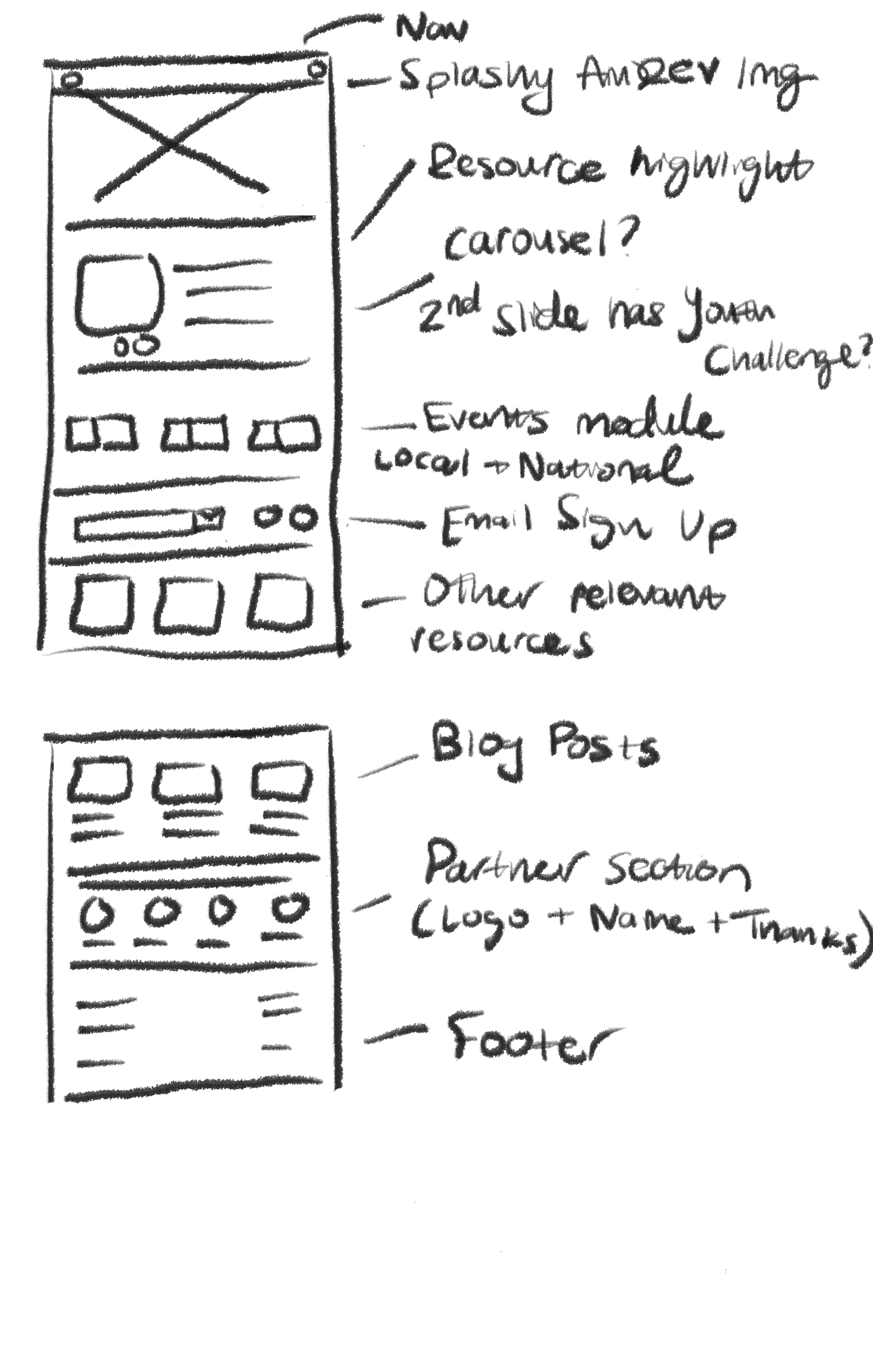
Lo Fi Wireframes
I then began to clean up the sketches and create a low fidelity wireframes to share with product and stakeholders.

LEVERAGING AI TOOLS INTO WORKFLOW
Our Digital Design team collaborated with the Innovation team to create an internal AI UX Copywriting plugin for Figma. This copywriting plugin contains documentation for the PBS brand and voice that informs the content it generates. In order to reduce time spent deliberating copy, I utilized the plugin when creating initial designs. For example, when prompting some copy for the hero section with the context of it being for a new Ken Burns film, the AI plugin generated this copy:
”Join PBS in commemorating the country's 250th Anniversary with content from Ken Burns' American Revolution exploring how the United States came together, showcasing its rich history, treasured artifacts, and performances and art that define America.”
INITIAL CONCEPTS
I drafted some initial concepts with the requested elements. I incorporated some of the imagery I had seen from the PBS.org site and documentary page.
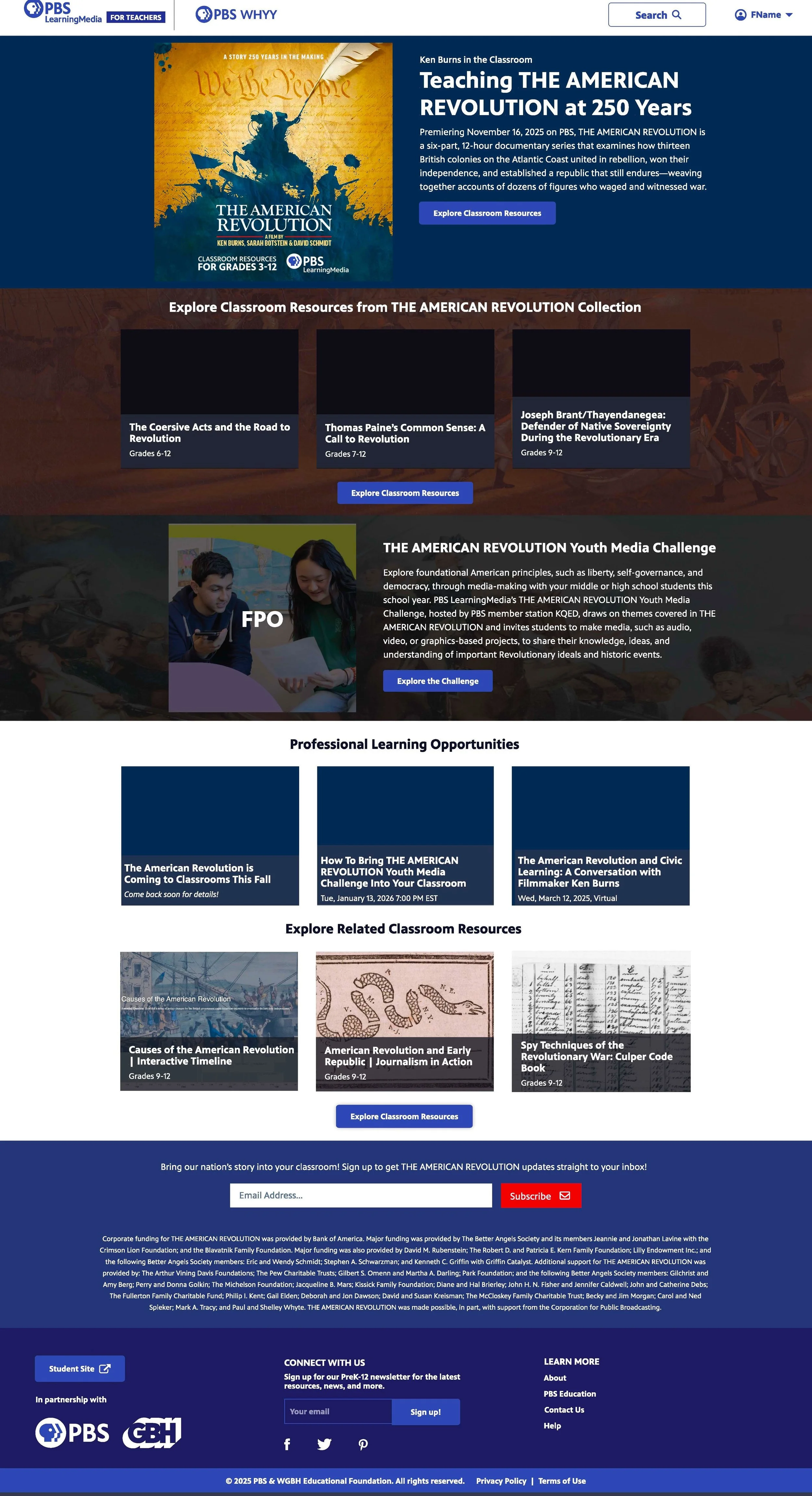
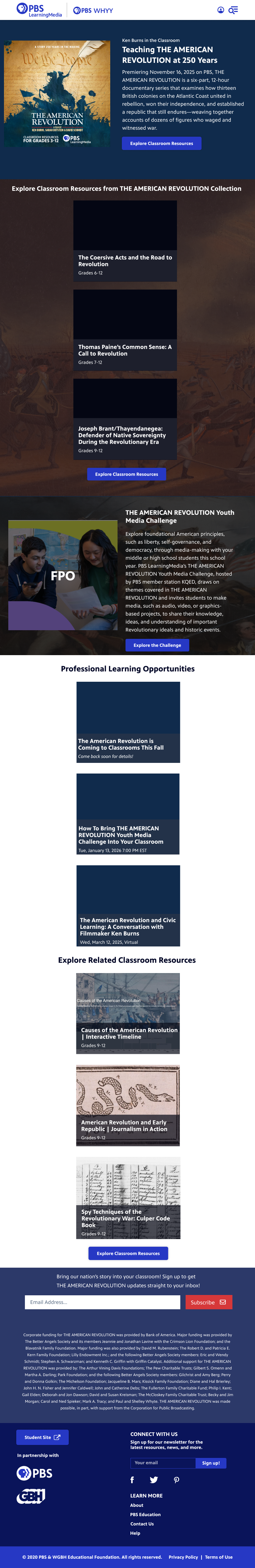
UPDATING DESIGN BASED ON FEEDBACK
Per feedback from product and marketing, we made some improvements:
Included the same partner messaging as is on the Ken Burns American Revolution Site
Added imagery to the Youth Media Challenge
Removed the Virtual Sessions section
Tweaked the UI on the newsletter sign up section
Swapped in new images per licensing requirements
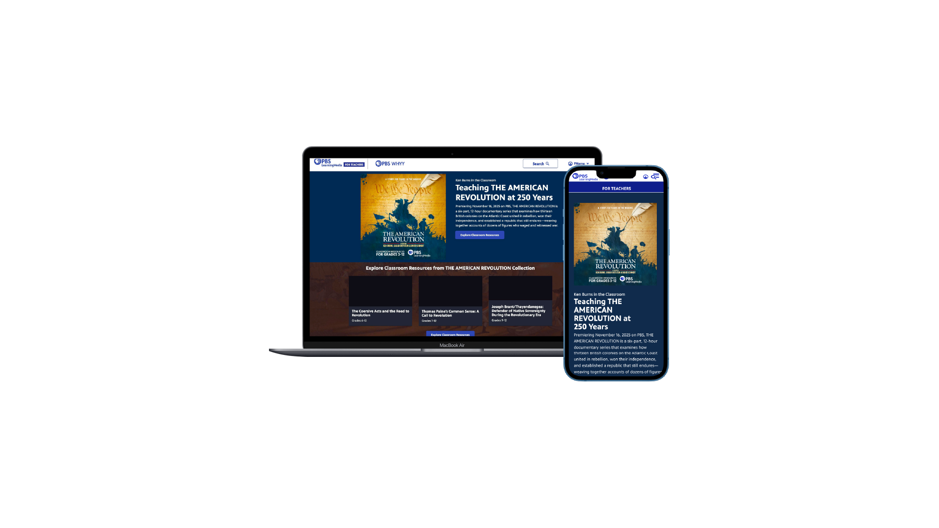
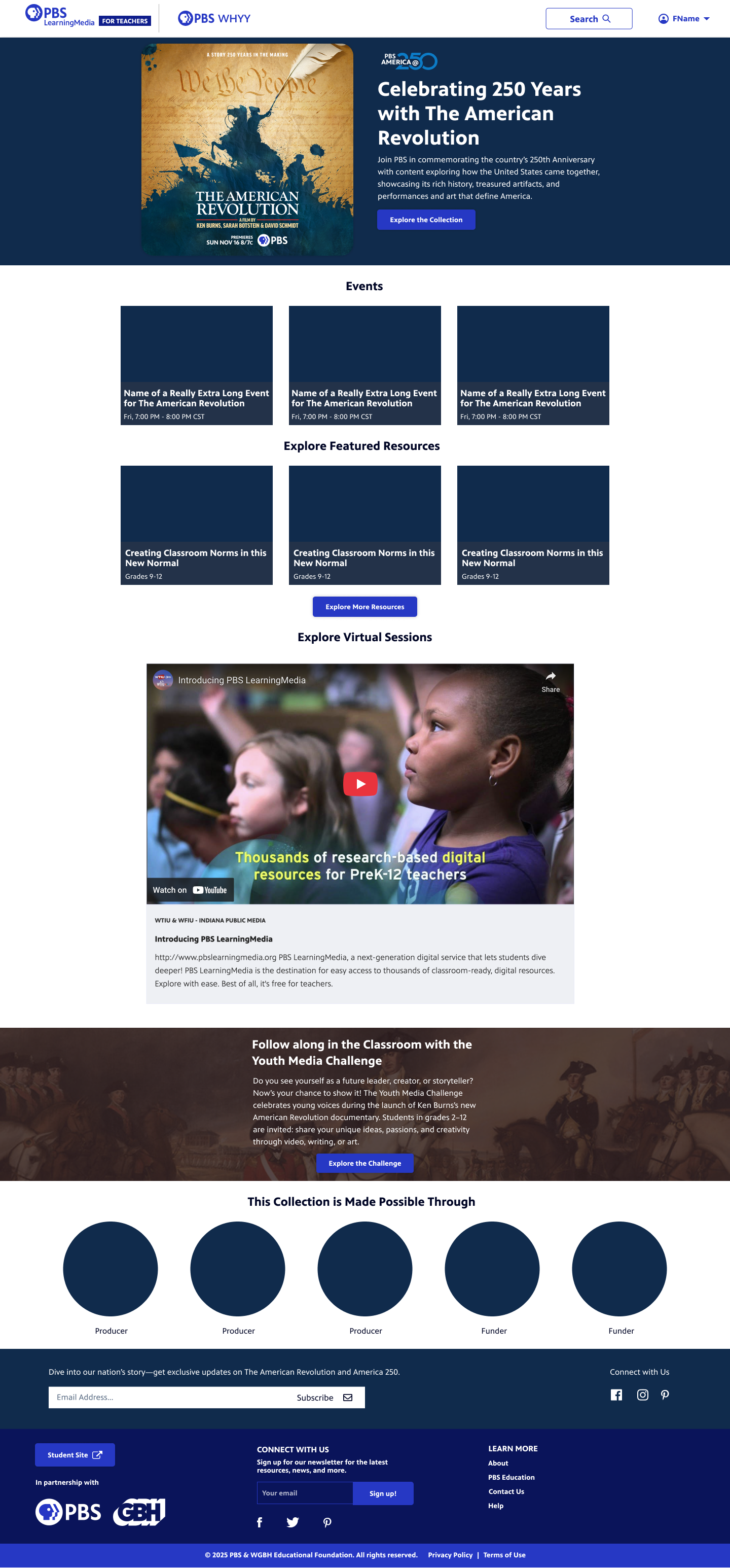
Final Production Screens
Below are the final production screens with some notes for Developers. The screens include both a mobile, desktop, and tablet section.

REFLECTION + TAKEAWAYS
Implementing AI saved time. I proposed an AI copywriting plugin that our design team had built that saved our team 12 weeks of lead time coordinating a final deliverable to the film producers and created a great foundation to tweak copy rather than be generated from scratch and slow down the delivery of the design.
Less can sometimes be more. This project started with a lot of ideas and even systemic thinking around how we could implement our PBS.org event module into this page but we found that our users would value clarity and simplicity over lots of features.
THE IMPACT
Valued by producers - The film producers gave positive feedback on this page and felt clear and aligned with their brand, which showcased my ability to navigate high-pressure, high-stakes environments and translate complex and niche asks into setting a precedent for the Education team to deliver to clients with high trust and consistency.
Familiar brand for classroom impact. Ken Burns is a recognized brand within the PBS ecosystem that teachers have said they value in the classroom. This hub, like others before it, will be a high traffic page when realeased.
Use case for AI plugin - This project got positive feedback from both internal PBS staff as well as Stakeholders and Producers saying that they found the solution quick, useful and delightful. The product team also appreciated the lower fidelity designs and visual user flows as a starting point for discussion and this approach has been used in future projects.